

Table of contents
- Power is nothing without control and direction, if a car has all the gas it needs to travel around the world but without controlled steering or a kind of control mechanism, then danger awaits anybody seeking the pleasure of skydiving 12,500ft AGL (Above Ground Level) without having a parachute.
- Here are eight practical reasons with a cited example of why you should learn flexbox.
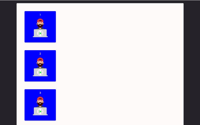
- Block Element Default State
- 1. Align block elements horizontally easily in Flexbox
- 2. Center item(s) in the middle of the container in Flexbox
- 3. Distribute space between items with flexbox
- 4. Push items to the end of container
- 5. Building relative size column layout:
- 6. Building responsive layout with and without media queries:
- 7. Change item order:
- 8. Change the position of an item inside a flex container:
Power is nothing without control and direction, if a car has all the gas it needs to travel around the world but without controlled steering or a kind of control mechanism, then danger awaits anybody seeking the pleasure of skydiving 12,500ft AGL (Above Ground Level) without having a parachute.
When it comes to CSS control is everything, no matter how good you are at selecting and combining colors, without a proper understanding of how to layout, align and distribute elements in a container then those beautiful colors will lose their actual purpose .
What is flexbox and why should we learn it? Flexbox layout makes it easier for us to design a flexible responsive layout without the use of float or positioning. While float is nice when we are trying to have a good time at the pool, life becomes difficult for a developer when he or she is being ask to design a layout and restricted to just float. Floats work really well in small cases like when there’s an element, such as a button, that you’d like to move to the right of a paragraph. But the real issue arises when you start using floats to lay out entire web pages. And the reason for that is: floats are not meant for layouts! Floats by design were created to allow flowing text around an image. If that’s the case, then why is it being used for layouts? Because of the clear: both hack. The clear property allows a block element underneath the parent of the floated element to not be affected by the float property. This means that you can have a column floated to the left, another floated to the right, and a footer added to the bottom taking up the entire width and left unaffected. Because of this ability, floats have been used in web layouts time and time again.
Since they weren’t considered for full web layouts when they were built, using floats as such usually leads to layouts breaking unexpectedly, especially when it comes to responsive design, and that can get quite frustrating. Keep in mind, development these days is all about responsive design, so… yes, that’s where the struggle lies.
Why should I learn flexbox ?
Here are eight practical reasons with a cited example of why you should learn flexbox.
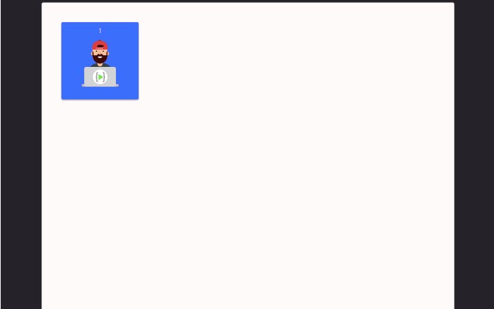
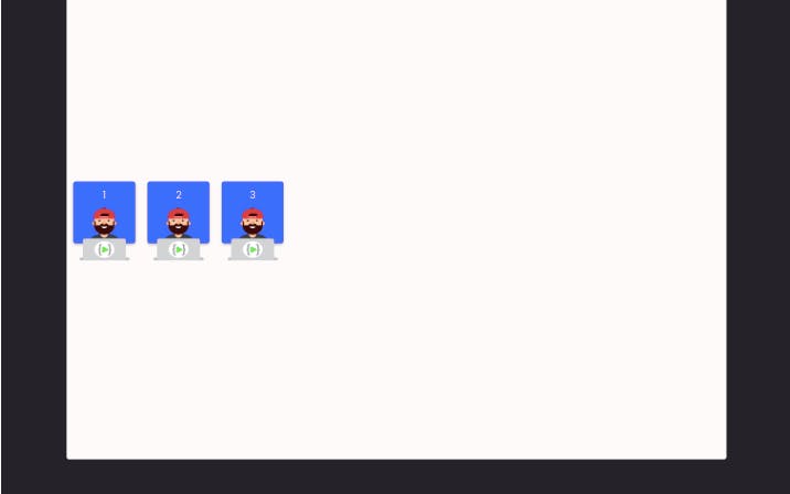
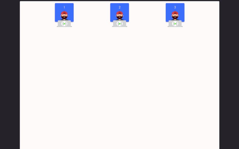
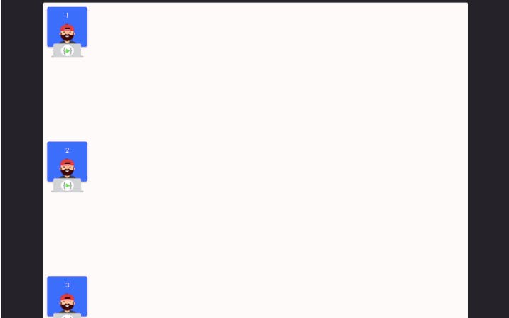
By default block elements are stacked on top of one another. Let's create a container with div's inside and apply some CSS properties to make our container and div look cool.
   <h1> Block elements in the default document flow </h1>
      <div class="container">
        <div class="box">
          <div class="num">1</div>
          <img src="./images/mascot.png" alt="">
        </div>
        <div class="box">
          <div class="num">2</div>
          <img src="./images/mascot.png" alt="">
        </div>
        <div class="box">
          <div class="num">3</div>
          <img src="./images/mascot.png" alt="">
        </div>
      </div>
    </div>
   .top {
  padding-bottom: 20px;
  margin-bottom: 20px;
}

.container {
  background-color: snow;
  border: 1px solid lightgray;
  height: 800px;
  border-radius: 4px;
}

.box {
  width: 200px;
  margin:50px;
  height: 200px;
  border-radius: 4px;
  box-shadow: 0px 2px 4px rgba(0, 0, 0, 0.25);
  background-color: blue;
  text-align: center;
  padding-top: 10px;
}
Block Element Default State
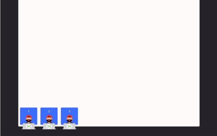
1. Align block elements horizontally easily in Flexbox
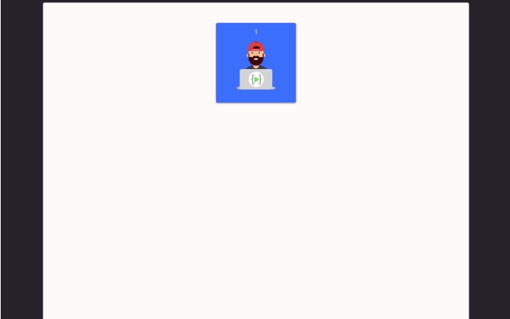
We can easily and without stress align block elements on the horizontal axis by using the flexbox property "display: flex" property which takes the elements from their normal document flow (default position) and placed the elements on the horizontal axis.
.top-1 .container {
  display: flex;
}
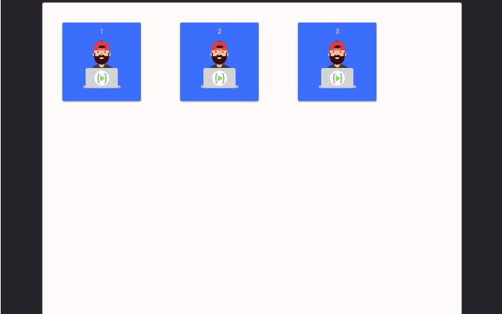
You can see how easy and flexible life has become by just setting the display to flex.
2. Center item(s) in the middle of the container in Flexbox
In this case, two flexbox properties will be put togther to achieve the goal of placing the item at the center of the container. These two properties are "Justify-content: center" and "align-items: center"
.top-1 .container {
  display: flex;
  justify-content:center;
  align-items:center;
}
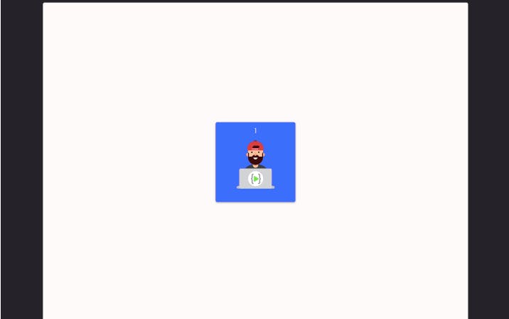
a. Justify-content:
Justify-content properties helps in positioning our items horizontally, there are several values which can be applied based on the angle we intend to place our items.
Flex-Start:
This place the items horizontally at the top left corner of the container.
.top-1 .container {
  display: flex;
  justify-content:flex-start;

}
Center:
This place the items horizontally at the center of the container.
.top-1 .container {
  display: flex;
  justify-content:center;

}
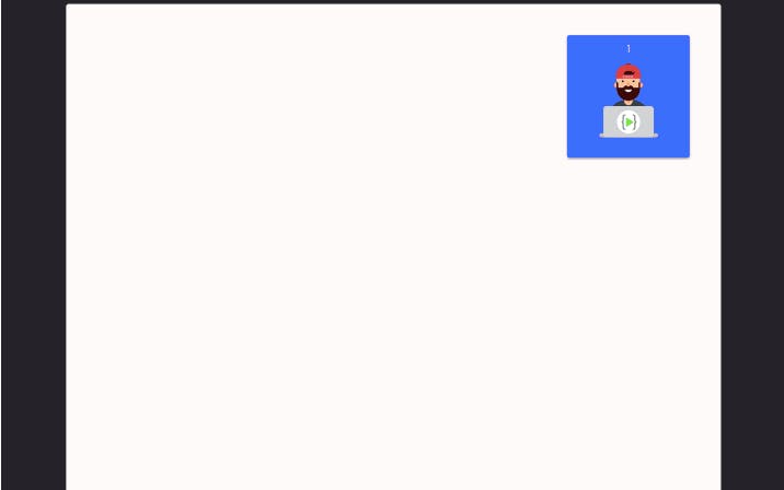
Flex-end:
This placed the items horizontally at the end of the container.
.top-1 .container {
  display: flex;
  justify-content:flex-end;

}
b. Align-items:
Align-items properties help in positioning our items vertically in the container, just like justify-content several values can also be applied based on the angle we intend to place our items.
flex-start:
This place the items vertically at the top left corner of the container.
.top-1 .container {
  display: flex;
  align-items:flex-start;

}
Center:
This place the items vertically at the center of the container.
.top-1 .container {
  display: flex;
  align-items:center;

}
Flex-end:
This place the items vertically at the end of the container.
.top-1 .container {
  display: flex;
  align-items:flex-end;

}
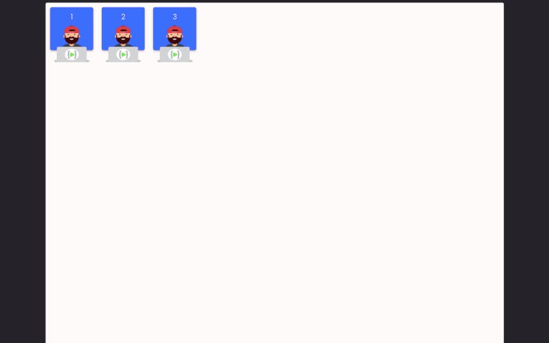
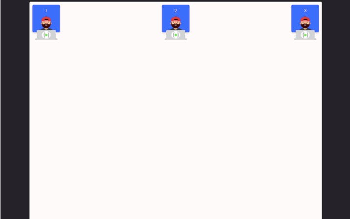
3. Distribute space between items with flexbox
Using flexbox we can easily distribute the spaces between our items in the container equally by applying these justify-content values.
Justify-content space-between:
This gives equal space between items in a container horizontal wise. For this example we will make use of three div's
.top-1 .container {
  display: flex;
  justify-content:space-between;

}
Justify-content space-around:
This add equal spaces around the items
.top-1 .container {
  display: flex;
  justify-content:space-around;

}
Justify-content space-evenly:add space between the items it also create equal space before the first item and after the last item in a container horizontal wise.
.top-1 .container {
  display: flex;
  justify-content:space-evenly;

}
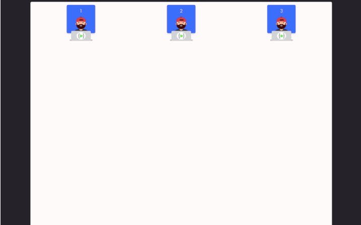
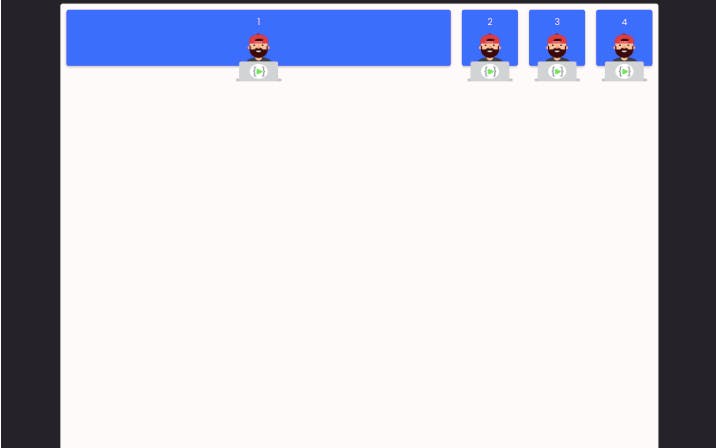
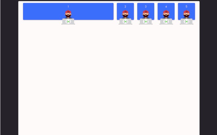
4. Push items to the end of container
With flexbox pushing items to the end of the container is easy and fun we are going to explore few options in achieving this task.
Justify-content space-between:
This gives equal space between items in a container horizontal wise. For this example we will make use of three div's
.top-1 .container {
  display: flex;
  justify-content: space-between;

}
This can be applied when build a navigation bar with items place at both end in the case of mobile application where you have just logo at the left top end and the menu icon and the opposite corner.
Empty div with flex-grow:
When we have more than two items in our navigation bar that we want to push to both end of the container then much is demanded and finding a way to achieve this is a bit complex. The first option which was applied for two items will definitely not be a solution here and we start cracking our head. With the flex-grow property, flexbox will never leave you stranded and always has that solution that keeps you standing up there like a super duper developer. How does this property helps split these items to both end of the container? Add an empty div with flex-grow 1 between the second item and the last item (third item) when this is done the empty div expand as much as it can and pushes the last item to the end of the container.
<div class="container">
        <div class="box">
          <div class="num">1</div>
          <img src="./images/mascot.png" alt="">
        </div>
        <div class="empty-div"></div>
        <div class="box">
          <div class="num">2</div>
          <img src="./images/mascot.png" alt="">
        </div>
        <div class="box">
          <div class="num">3</div>
          <img src="./images/mascot.png" alt="">
        </div>
      </div>
    </div>
.top-1 .container .empty-div{
  flex-grow:1;
}
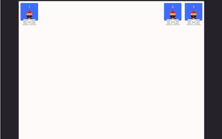
This principle can be applied when building a navigation bar that places the logo at the left top corner and all the other menu items at the right top corner.
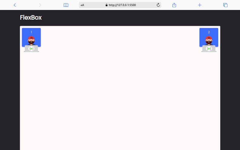
Flex-grow for one item:
When we have two items and we are intrested in spaning the first item from its start point towards where the second item is located, then the flex-grow one property is definitely the right choice to achieve such a task.
<h1> FlexBox </h1>
  <div class="top top-1">

    <div class="container">
      <div class="box">
        <div class="num">1</div>
        <img src="./images/mascot.png" alt="">
      </div>
      <div class="box">
        <div class="num">2</div>
        <img src="./images/mascot.png" alt="">
      </div>
    </div>
  </div>
.top-1 .container .box:first-child{ flex-grow:1; }
A use case for this will be when trying to build a search area for your application
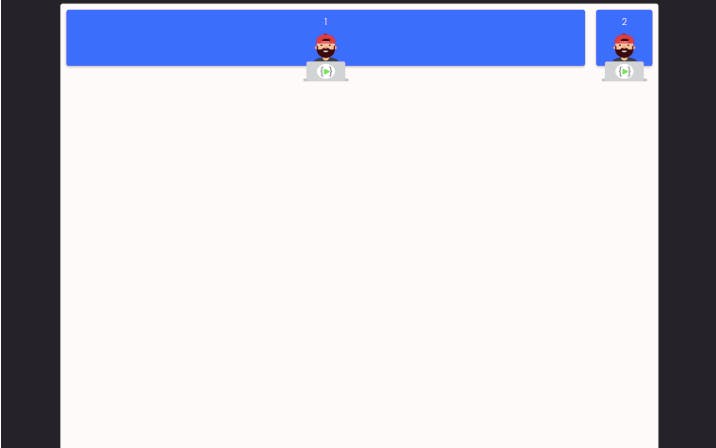
5. Building relative size column layout:
We can build a relative column using flexbox by giving the item a flex value of flex: {number}, when this is done the size of the item becomes controllable.
<h1> FlexBox </h1>
    <div class="top top-1">

      <div class="container">
        <div class="box box1">
          <div class="num">1</div>
          <img src="./images/mascot.png" alt="">
        </div>

        <div class="box box2">
          <div class="num">2</div>
          <img src="./images/mascot.png" alt="">
        </div>
        <div class="box box3">
          <div class="num">2</div>
          <img src="./images/mascot.png" alt="">
        </div>
        <div class="box box4">
          <div class="num">2</div>
          <img src="./images/mascot.png" alt="">
        </div>
      </div>
    </div>
.top-1 .container {
  display: flex;

}

.top-1 .box1{
  flex-grow:3;
};

.top-1 .box2{
  flex-grow:1;
};

.top-1 .box3{
  flex-grow:1;
};

.top-1 .box4{
  flex-grow:1;
};
The total column in this layout is 6, box1 ocuppies 3 columns while the three other boxes(2,3,4) are occupying 3 columns each spanning 1 column. This principle can be applied in building table layout.
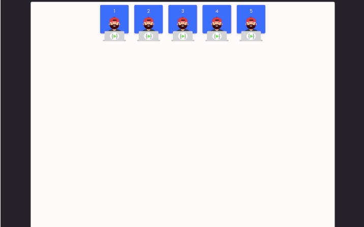
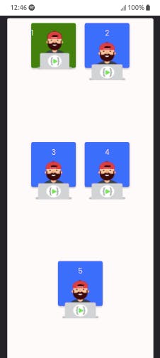
6. Building responsive layout with and without media queries:
When we open our layout in a large screen all the items displays but when we try the same in a smaller screen then the problem of responsiveness arrive so how do we tackle this issues because when it comes to the modern day web application responsivesness is very much important, every company wants their products to be easily accesed in any device even upto smart watch which can be used to browse.
- Responsive layout without media query:
With flexbox flex-wrap property and value we can build a responsive layout by Giving a flex container flex-wrap: wrap makes the container responsive and prevent the items inside the container from shrinking.
<h1> FlexBox </h1>
    <div class="top top-1">

      <div class="container">
        <div class="box box1">
          <div class="num">1</div>
          <img src="./images/mascot.png" alt="">
        </div>

        <div class="box box2">
          <div class="num">2</div>
          <img src="./images/mascot.png" alt="">
        </div>
        <div class="box box3">
          <div class="num">3</div>
          <img src="./images/mascot.png" alt="">
        </div>
        <div class="box box4">
          <div class="num">4</div>
          <img src="./images/mascot.png" alt="">
        </div>
        <div class="box box5">
          <div class="num">5</div>
          <img src="./images/mascot.png" alt="">
        </div>
      </div>
    </div>
.top-1 .container {

  display: flex;
  justify-content:center;
  flex-wrap:wrap;

}
large screen device
Small screen device
Smaller screen device
-Responsive layout with media query:
With media queries, we will have more control over the size of the items. Say that inside a flex-wrap container we want to have 2 columns. We can do this by:
 display: flex;
  justify-content:center;
  flex-wrap:wrap;

}

.top-1 .box1{
  flex-basis:50%;
}
Here we are using flex-basis to set the width of box1 to span half of the container which is 50% while the other boxes will take the remaining half of the container which is 50%.
@media only screen and (max-width: 375px) {
  .top-1 .box1 {
    display: flex;
    flex-basis: 25%;
    background:green;


  }
}
While the width was made 50% for large screen we apply media query for small screen and made the flex-basis 25% to be able to adapt with small screen.
7. Change item order:
Image you had to change the order of items in your page, placing the first item at the last position and the last at the first position, this will definetly requires much thinking on how to manipulate your item to achieve this task, but with flexbox order property we can easily achieve this.
.top-1 .box1{
  order:1;
}

.top-1 .box5{
  order:-1;
}
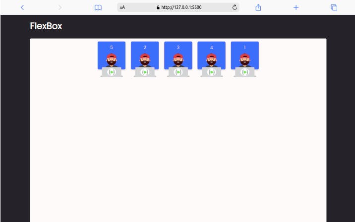
By giving item1 order 1 placed the item at the end also giving item5 order -1 to the last item placed it at the front.
8. Change the position of an item inside a flex container:
An item inside the flex can change position by itself by using align-self
here are some values we can apply while using align-self
align-self: auto | flex-start | flex-end | center | baseline | stretch;
.top-1 .box1{
  align-self:flex-end;
}
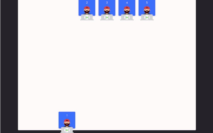
The flex-end values moved the single item to the bottom of the container.
Flex-direction:
Flexbox has a flex-direction property by default. flex-direction has the value of row, which means that items are aligned on the horizontal axis. If we want items to be aligned on the vertical axis, we can use flex-direction: column;
.top-1 .container {

  display: flex;
  flex-wrap:wrap;
  justify-content: space-between;
  flex-direction: column;

}
These flexbox properties can help you in building layouts without stress and also make your work faster when you understand how to apply them. To learn more about flexbox check out these sites